You walk into a fast food restaurant and feel a sudden urgency to order quickly and leave. You open a banking app and feel an immediate sense of calm trust. You pick up a luxury product from a shelf and feel, before reading a single word, that it is worth more than the one next to it. None of these experiences happened by accident. Someone made deliberate color decisions that created each of those feelings in you before your conscious mind had a chance to form an opinion. Color theory in design is the organized body of knowledge behind those decisions. It is the framework that explains why certain colors feel certain ways, how colors interact with each other to create harmony or tension, what happens psychologically when specific hues appear in specific contexts, and how designers use all of this to communicate meaning, guide behavior, and shape experience. It is not a soft or optional area of design knowledge. It is one of the most powerful and most practically applicable frameworks a designer, marketer, or visual communicator can master.
What Color Theory Actually Is
Color theory is not a single idea or a simple set of rules. It is a body of knowledge that has developed over centuries, drawing from physics, psychology, art history, neuroscience, and cultural studies. At its most fundamental level, color theory describes the nature of color itself: what it is physically, how the human visual system perceives it, and how different colors relate to each other in ways that are consistent and predictable enough to build design systems around. The formal study of color theory in Western art began in earnest with Isaac Newton’s discovery in 1666 that white light passing through a prism separates into the visible spectrum of colors. But the design applications of color theory were most systematically developed in the 19th and 20th centuries through the work of Johann Wolfgang von Goethe, whose 1810 book on color explored its psychological dimensions, Johannes Itten and Josef Albers, whose teaching at the Bauhaus school produced foundational principles still used in design education today, and Albert Munsell, whose color notation system provided designers with a precise, measurable vocabulary for describing and specifying color. Modern color theory in design integrates all of these historical contributions with contemporary research in visual neuroscience and cross-cultural color psychology to produce a practical framework that working designers apply every day in decisions ranging from brand identity to user interface design to environmental graphics.
The Color Wheel: Foundation of All Color Relationships
Primary, Secondary, and Tertiary Colors
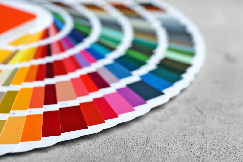
The color wheel is the central organizing structure of color theory in design, and understanding it is not optional background knowledge. It is the practical vocabulary through which all color relationships are described and managed. The traditional RYB color wheel, based on red, yellow, and blue as primary colors, has been used in art and design education for centuries and remains the foundation for understanding pigment-based color relationships in print and physical design. The RGB color model, based on red, green, and blue light, governs color relationships in screen-based and digital design. The CMYK model, based on cyan, magenta, yellow, and black, governs four-color printing processes. Understanding which color model applies to your medium is the first practical application of color theory in design, because color relationships that work beautifully in one model can behave differently in another. Primary colors are those that cannot be created by mixing other colors. Secondary colors are created by mixing two primary colors in equal proportions. Tertiary colors are created by mixing a primary with an adjacent secondary, producing the twelve-step color wheel that serves as the basic map of color relationships in most design education. This map is not just descriptive. It is predictive. The positions of colors on the wheel tell you how they will interact, whether they will harmonize or contrast, support or compete, soothe or energize when placed together in a composition.
Hue, Saturation, and Value: The Three Dimensions of Color
Every color has three properties that can be independently adjusted and that together determine its complete character and how it behaves in a design context. Hue is the property most people mean when they say “color,” the basic identity of a color as red or blue or green or any of the positions on the color wheel. Saturation, sometimes called chroma or intensity, refers to the purity or vividness of a color. A fully saturated red is the purest, most intense red possible. A desaturated red moves toward grey, becoming muted, sophisticated, or melancholy depending on context. Value refers to the lightness or darkness of a color, its position on the scale from white to black. A high-value color is light and luminous. A low-value color is dark and heavy. These three properties work together to create the full range of colors available to a designer, and skilled color theory in design involves managing all three dimensions simultaneously rather than just choosing a hue. A design that uses the right hues but wrong saturation levels will feel off in ways that are difficult to diagnose without the vocabulary to identify the problem. A design that has beautiful hue relationships but poor value contrast will fail in accessibility and visual hierarchy even if the colors look attractive in isolation. The most sophisticated color decisions in professional design involve precise, intentional adjustments across all three dimensions.
Color Harmony: The Science of Colors That Work Together
Complementary, Analogous, and Triadic Schemes
Color harmony refers to the combination of colors in ways that feel visually satisfying and coherent rather than random or discordant. Color theory in design provides several systematic approaches to harmony that are derived directly from the structure of the color wheel and that produce reliably effective results when applied with understanding. Complementary color schemes use colors positioned directly opposite each other on the color wheel, such as blue and orange or red and green. Complementary colors create the highest possible contrast when placed side by side, making each appear more vivid and saturated than it would appear alone. This principle, called simultaneous contrast, is why a red object on a green background appears almost to vibrate visually. Complementary schemes are powerful for creating attention and emphasis but require careful management of proportion and saturation to avoid visual aggression. Analogous color schemes use colors that sit adjacent to each other on the color wheel, such as blue, blue-green, and green. Analogous colors share undertones that make them naturally harmonious and easy on the eye. They create a sense of cohesion, calm, and visual flow that makes them popular choices for interfaces, brand identities, and environmental design where sustained visual comfort matters. Triadic schemes use three colors equally spaced around the color wheel, creating a balance of variety and harmony that is more dynamic than analogous schemes but more balanced than complementary ones. Each of these harmonic systems produces a different emotional and visual character, and choosing the right system for a design problem requires understanding what kind of experience you are trying to create before reaching for any color at all.
Split-Complementary and Tetradic Schemes
Beyond the basic harmonic systems, color theory in design includes more complex relationship structures that give designers additional tools for creating sophisticated, multi-color palettes with internal logic and coherence. The split-complementary scheme takes one anchor color and pairs it with the two colors adjacent to its complement rather than the complement itself, creating a palette that has the visual interest of complementary contrast without the maximum tension that direct complementary pairing produces. This is often a more practical choice than pure complementary for designs that need visual energy without aggressive contrast. The tetradic or double-complementary scheme uses four colors arranged as two complementary pairs, creating the richest and most complex harmonic structure available in standard color theory. Tetradic schemes are challenging to balance because they involve four distinct hues that must be managed in careful proportional relationship to prevent visual chaos, but when executed well they produce palettes of remarkable richness and versatility. Professional designers who work with large, multi-element design systems often use tetradic structures as the foundation for palettes that need to cover a wide range of use cases while maintaining coherent visual identity across all of them.
Expert Perspective: “The mistake I see most often in designers who have not fully internalized color theory is treating color harmony as a formula to follow rather than a set of principles to understand. The color wheel gives you a starting point, not a prescription. The harmony system you choose should emerge from the emotional and communicative requirements of the design problem, not from a default preference or a random selection. Color theory in design is a decision-making framework, not a shortcut.” – Professor Leila Asgari, Color Theory and Design Systems, Royal College of Art, London
Color Psychology: What Colors Do to People
Emotional Associations and Their Design Implications
Color psychology is the study of how colors affect human mood, emotion, cognition, and behavior, and it is one of the most practically important dimensions of color theory in design. The associations between colors and emotional states are not entirely universal or hardwired, but they are sufficiently consistent within cultural contexts to be predictably applicable in design decisions. Red is universally associated with urgency, energy, passion, and danger across most cultures. It raises heart rate, accelerates breathing, and creates a physiological state of arousal that makes it powerful for calls to action, warning signals, and any design context where immediate attention and response are the goal. Blue is the most globally trusted color in consumer research and is consistently associated with calm, reliability, competence, and authority. This is why it dominates financial services, healthcare, and technology branding, where trust and competence are the primary emotional messages that need to be communicated. Yellow is associated with optimism, warmth, and attention. It is the most visible color to the human visual system in daylight conditions, which makes it highly effective for wayfinding and safety signage, but its associations with caution when used in deep saturated form make it contextually sensitive in brand design. Green’s associations span a wide range from nature, health, and growth to wealth and permission, making it one of the most contextually variable colors in design application. Understanding the specific associations most likely to be activated by a color in your specific design context, with your specific audience, in your specific cultural setting, is one of the most sophisticated skills in applied color theory.
Cultural Variation and the Limits of Universal Rules
A critical dimension of color psychology in design that is frequently underemphasized in basic color theory education is the significant cultural variation in color associations and meanings. White is the color of purity and celebration in Western cultures and the color of mourning in many East Asian cultures. Red carries associations of good fortune and celebration in Chinese cultural contexts but danger and warning in many Western safety contexts. Purple’s associations with royalty in Western history stem from the historical rarity and expense of purple dye, but these associations do not translate uniformly across cultures that did not share that specific history. Green has positive nature and health associations in many Western contexts but can carry negative associations in some Middle Eastern contexts depending on specific shade and application. These cultural variations are not edge cases or academic concerns. They are practical design realities that matter enormously for any design work intended for multicultural audiences or international markets. A color decision that works beautifully for a domestic Western audience can communicate unintended and counterproductive messages to audiences from different cultural backgrounds. Serious application of color theory in design requires research into the specific cultural associations most relevant to the intended audience, not just application of the general psychological principles derived from Western design and psychology research.
Color in Branding and Visual Identity
Color is the most immediately recognizable element of a brand identity. Research on consumer brand recognition consistently shows that color alone accounts for a substantial portion of visual brand recognition before shape, typography, or any other element is consciously processed. This makes color decisions in brand identity some of the highest-stakes applications of color theory in design, with long-term consequences for how a brand is perceived, trusted, and differentiated in its competitive market. The Coca-Cola red is so specific and so consistently applied that it has become synonymous with the brand itself across over a century of global marketing. The Tiffany blue is trademarked and is arguably the most recognizable single color application in retail luxury branding. The FedEx orange and purple combination is instantly recognizable even without any accompanying typography. These are not accidents of aesthetic preference. They are the result of deliberate, theory-informed color decisions that were then maintained with extraordinary consistency over time, allowing the color to accumulate brand meaning through repetition and association. For designers working on brand identity, color theory in design informs not just the initial color selection but the complete specification of the brand color system: the primary colors, the secondary palette, the precise CMYK, RGB, and Pantone specifications, the guidelines for how colors may be combined and in what proportions, and the rules governing color application across different media and contexts. This level of specificity and systematization is only possible with a thorough understanding of color theory as a foundation.
Color Accessibility and Inclusive Design
One of the most important and most frequently neglected dimensions of color theory in design is its relationship to accessibility and inclusive design practice. Approximately 8 percent of men and 0.5 percent of women have some form of color vision deficiency, commonly called color blindness, which affects their ability to distinguish between certain colors. The most common form is red-green color vision deficiency, which makes it difficult or impossible to distinguish between reds and greens of similar value. Designs that rely solely on color to convey information, such as using red text for errors and green text for success states in a user interface, create genuine barriers for users with color vision deficiency. Accessible color design uses sufficient value contrast between colors carrying different meanings, supplements color coding with additional visual cues like icons or text labels, and tests designs with color blindness simulation tools to verify that the design functions for users across the full range of color vision. The WCAG, Web Content Accessibility Guidelines, specify minimum contrast ratios between text and background colors for digital design, and meeting these standards is both an ethical design responsibility and, in many contexts, a legal requirement. Understanding value contrast and color relationships deeply enough to design accessibly requires exactly the kind of systematic color knowledge that color theory in design provides.
Expert Perspective: “Accessibility is not a constraint on good design. It is evidence of good design. A color system that only works for people with typical color vision is a color system that was designed without adequate knowledge of how color actually works for real humans. Color theory gives you the tools to design color systems that are both beautiful and genuinely functional for the full range of people who will use them.” – Marcus Webb, Inclusive Design Lead and Color Accessibility Specialist, Toronto
Final Thought
Color is the element of design that works before the viewer is ready. Before they read a word, before they consciously notice the layout, before they form any deliberate opinion, color has already told them how to feel and whether to trust. That is a remarkable amount of communicative power packed into something as seemingly simple as a choice between blue and green, between saturated and muted, between warm and cool. Color theory in design is the body of knowledge that makes that power accessible, predictable, and intentional. Designers who understand it do not just make things that look good. They make things that work, that communicate with precision, that create the specific experiences they were designed to create. And in a world where every surface, every screen, and every brand is competing for human attention and trust, that kind of intentionality is not a luxury. It is the difference between design that moves people and design that simply occupies space.