Color surrounds human life in ways most people barely notice. It shapes emotions, influences decisions, affects memory, and changes how environments feel. A warm café feels inviting partly because of its earthy tones. A luxury brand appears elegant through deep blacks and gold accents. A calming hospital room often uses soft blues or greens to reduce stress and anxiety. Behind all these choices lies the powerful foundation of color theory basics.
Color is more than decoration. It is a language. Designers, artists, photographers, filmmakers, marketers, and architects use color intentionally to communicate mood, identity, and emotion. Even digital platforms rely heavily on color psychology to guide user behavior and attention. From websites and packaging to fashion and interior spaces, color has the power to shape experiences before a single word is read.
Understanding color theory basics helps people create visuals that feel balanced, meaningful, and emotionally effective. It explains why certain color combinations feel harmonious while others feel uncomfortable. It also reveals why some colors energize audiences while others calm them down.
In modern visual culture, color literacy has become increasingly valuable. Whether someone is building a brand, designing artwork, decorating a home, or creating social media content, understanding how colors interact can dramatically improve communication and aesthetic impact.
This guide explores the foundations of color theory, the emotional psychology behind colors, the structure of color harmony, and the practical role color plays in modern design industries.
The Origins of Color Theory
How Humans Began Studying Color
Humans have been fascinated by color for thousands of years. Ancient civilizations used pigments in art, religious ceremonies, architecture, and storytelling long before scientific explanations existed. Early philosophers attempted to understand how colors formed and why people responded emotionally to them.
The formal study of color evolved significantly during the scientific revolution. Thinkers such as Isaac Newton transformed color theory by demonstrating that white light could be separated into a visible spectrum using a prism. This discovery changed how artists and scientists understood color relationships.
Over time, painters, psychologists, and designers expanded these ideas into practical systems used in visual communication today. Modern color theory combines science, art, emotion, and cultural symbolism into one powerful creative framework.
Why Color Became Essential in Visual Culture
As media evolved, color became increasingly important in shaping public perception. Advertising agencies used color to influence consumer behavior. Filmmakers used lighting and palettes to intensify emotional storytelling. Fashion designers used tones and contrasts to communicate personality and status.
Digital technology further increased the importance of color theory basics. Websites, mobile apps, branding campaigns, streaming platforms, and social media content now rely heavily on color psychology to attract attention and improve user experience.
Color became more than artistic expression. It became a strategic communication tool.
Understanding the Color Wheel
The Foundation of Color Relationships
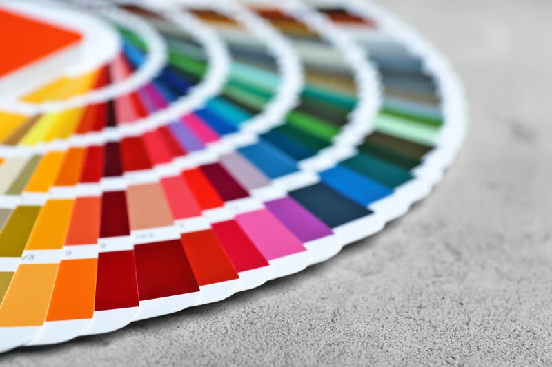
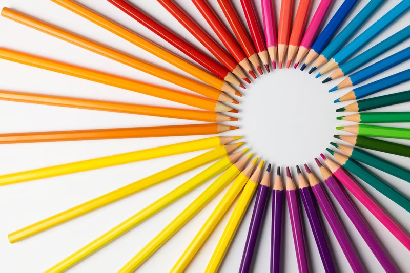
The color wheel is one of the most important tools in color theory basics. It visually organizes colors based on their relationships to one another. This system helps designers understand harmony, contrast, and balance.
The traditional color wheel begins with primary colors. Red, blue, and yellow form the base because they cannot be created by mixing other colors. Secondary colors emerge when primary colors combine. Mixing blue and yellow creates green, red and yellow create orange, and blue and red create purple.
Tertiary colors develop by blending primary and secondary colors together. These combinations create richer and more complex shades used widely in modern design.
The color wheel helps creators choose combinations that either feel harmonious or intentionally dramatic depending on the emotional effect they want to achieve.
Warm Colors and Cool Colors
One of the most influential concepts in color theory basics is the division between warm and cool colors. Warm colors such as red, orange, and yellow often create feelings of energy, passion, warmth, and excitement. They feel visually active and emotionally intense.
Cool colors such as blue, green, and purple typically communicate calmness, trust, peace, and reflection. They create softer emotional atmospheres and are often associated with stability or relaxation.
Designers use these emotional differences carefully. Restaurants may use warm colors to encourage appetite and conversation, while healthcare environments may rely on cool tones to reduce stress and create calm experiences.
Color Harmony and Visual Balance
Why Some Color Combinations Feel Pleasing
Color harmony refers to combinations that feel balanced and visually satisfying. Harmonious palettes create comfort because the relationships between colors feel organized and intentional.
One popular harmony system is complementary color pairing. Complementary colors sit opposite each other on the color wheel, such as blue and orange or red and green. These combinations create strong contrast and visual energy.
Analogous color schemes use neighboring colors on the wheel. These palettes feel softer and more unified because the colors naturally blend together. Designers often use analogous schemes to create calm or elegant visual experiences.
Triadic color harmony uses three evenly spaced colors from the wheel. This approach creates balance while maintaining strong visual variety.
Understanding harmony helps creators avoid chaotic visuals and build designs that feel emotionally coherent.
The Role of Contrast in Design
Contrast is equally important in color theory basics because it creates focus and readability. Strong contrast directs attention toward important elements such as headlines, buttons, or focal points in artwork.
Without contrast, designs can feel flat or confusing. High contrast improves visibility and accessibility, especially in digital environments.
However, excessive contrast may overwhelm viewers emotionally. Successful designers balance harmony and contrast carefully to create visuals that are engaging without becoming exhausting.
The Psychology Behind Color Choices
How Colors Influence Human Emotion
Color psychology explores how colors affect emotional and psychological responses. Although reactions vary across individuals and cultures, certain emotional associations appear consistently across many societies.
Red often communicates passion, urgency, excitement, or danger. It is emotionally intense and frequently used in advertising, sports branding, and entertainment.
Blue is associated with trust, calmness, intelligence, and professionalism. Financial institutions and technology companies often favor blue because it creates feelings of reliability.
Yellow symbolizes optimism, energy, and creativity but can also create visual fatigue when overused. Green frequently represents nature, growth, health, and renewal. Black communicates sophistication, authority, and luxury, while white often symbolizes simplicity and purity.
These emotional responses explain why color decisions are rarely random in professional design industries.
Cultural Differences in Color Meaning
One important aspect of color theory basics is understanding that color symbolism changes across cultures. A color considered joyful in one society may symbolize mourning or caution in another.
For example, white is associated with weddings and purity in many Western cultures, while some Eastern traditions connect white with mourning and funerals. Red symbolizes luck and celebration in some Asian societies but may represent warning or aggression elsewhere.
Global brands must consider these cultural differences carefully when designing products, campaigns, or packaging for international audiences.
The Role of Color in Branding
Why Brands Depend on Color Identity
Color plays a massive role in branding because it creates emotional recognition. Many consumers recognize brands instantly through color before reading names or logos.
Luxury brands often rely on black, gold, or neutral palettes to communicate sophistication. Health and wellness companies frequently use green or blue tones to suggest calmness and trust. Fast-food chains often use red and yellow because these colors stimulate energy and appetite.
Strong color consistency helps brands create emotional familiarity over time. Consumers begin associating certain emotional experiences with specific visual palettes.
This is why understanding color theory basics is essential for businesses competing in crowded digital markets.
Emotional Trust and Consumer Behavior
Color affects purchasing decisions more than many people realize. Consumers often make rapid emotional judgments about products within seconds of seeing them.
Packaging color can influence whether a product feels premium, eco-friendly, affordable, modern, or trustworthy. Website color schemes affect user engagement and navigation behavior. Social media visuals use color strategically to increase attention and sharing.
Designers who understand emotional color psychology can create stronger audience connections and improve communication effectiveness.
Color Theory in Digital Design
Designing for Screens and User Experience
Digital environments require careful color management because screens display colors differently than print materials. Web designers and app developers use color theory basics to improve readability, navigation, and emotional engagement.
User interface design relies heavily on color hierarchy. Bright accent colors may highlight calls to action, while softer backgrounds reduce visual strain.
Accessibility is also a major consideration. Poor contrast combinations make digital content difficult to read for users with visual impairments. Inclusive design requires thoughtful color choices that balance beauty with usability.
As digital spaces become more competitive, effective color design has become a major factor in user retention and brand perception.
Minimalism and Modern Visual Trends
Modern digital design trends often favor minimal palettes with strategic use of accent colors. Clean layouts combined with strong visual hierarchy help users focus on key information.
However, bold and expressive palettes have also gained popularity in creative industries seeking emotional differentiation. Many brands now experiment with vibrant gradients, dynamic contrasts, and nostalgic retro palettes to stand out online.
Understanding foundational color theory allows designers to adapt confidently to changing visual trends without losing balance or clarity.
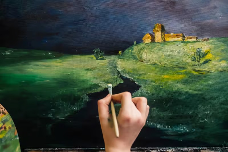
Color in Art, Film, and Photography
Storytelling Through Color
Visual storytelling depends heavily on color. Filmmakers use color grading to shape emotional atmosphere. Horror films may use cold, desaturated tones to create tension, while romantic scenes often feature warm lighting and soft palettes.
Photographers use color to direct emotional interpretation and focus. Painters have historically relied on color relationships to communicate movement, symbolism, and mood.
Even subtle shifts in color can completely transform how audiences interpret visual narratives.
Artists who understand color theory basics gain greater control over emotional storytelling and audience perception.
Symbolism and Emotional Depth
Colors often carry symbolic meaning within artistic traditions. Gold may represent divinity or wealth. Green may symbolize rebirth or jealousy depending on context. Purple has historically been associated with royalty and spiritual power.
Understanding symbolic color meaning allows artists and designers to create richer emotional experiences that resonate on psychological and cultural levels.
Common Mistakes Beginners Make With Color
Overusing Bright Colors
One common mistake in beginner design is using too many highly saturated colors at once. Excessive brightness creates visual noise and emotional fatigue.
Strong colors become more effective when balanced with neutral tones and controlled spacing. Strategic restraint often creates more sophisticated results than overwhelming intensity.
Professional designers know that simplicity frequently strengthens visual impact.
Ignoring Emotional Consistency
Another common issue is using colors that conflict emotionally with the intended message. A wellness brand using aggressive neon colors may confuse audiences emotionally. A luxury product with childish palettes may struggle to appear premium.
Successful design requires emotional alignment between color choices and communication goals.
Understanding the psychology behind color helps creators avoid these inconsistencies.
Expert Advice for Mastering Color Theory Basics
Professional designers often recommend studying color through observation rather than memorization alone. Watching how films use lighting, how brands create identity, or how nature combines tones naturally can strengthen visual intuition over time.
Experts also advise beginners to work with limited palettes initially. Too many colors create confusion and weaken composition. Restricting palettes helps designers focus on harmony, contrast, and emotional consistency more effectively.
Testing colors across different devices and lighting conditions is equally important. Colors rarely appear identical in print, mobile screens, and desktop monitors. Experienced designers constantly evaluate how palettes perform in real-world environments.
Another valuable recommendation is understanding emotional intention before selecting colors. Instead of choosing colors purely because they look attractive, creators should ask what emotional response they want audiences to feel.
The strongest visual designs combine technical understanding with emotional storytelling.
The Future of Color in Visual Culture
As technology evolves, color theory continues changing alongside it. Artificial intelligence, virtual reality, and immersive digital environments are creating entirely new possibilities for interactive color experiences.
Brands increasingly use dynamic palettes that adapt across devices and personalized experiences. Digital artists experiment with animated gradients, augmented reality visuals, and responsive interfaces that shift color based on user interaction.
At the same time, sustainability and emotional wellness are influencing modern color trends. Earthy palettes, calming neutrals, and nature-inspired tones have become increasingly popular in response to digital overload and fast-paced lifestyles.
Despite changing technology, the emotional power of color remains timeless. Human psychology continues responding deeply to visual tone, contrast, warmth, and harmony.
Conclusion
Understanding color theory basics opens the door to more meaningful, emotional, and visually effective design. Color is far more than decoration. It influences perception, shapes mood, communicates identity, and guides attention across nearly every form of visual culture.
From branding and digital design to film, photography, fashion, and interior spaces, color decisions affect how people think and feel. Warm colors energize audiences while cool tones create calmness. Harmonious palettes create comfort, while contrast builds focus and excitement.
The difference between average design and memorable visual storytelling often comes down to intentional color use. Designers who understand psychology, harmony, symbolism, and emotional consistency gain the ability to create stronger audience connections.
As technology and media continue evolving, color will remain one of the most powerful communication tools available. Learning color theory basics is not only valuable for artists and designers. It helps anyone understand how visual experiences shape emotions, behavior, and human connection in everyday life.
FAQs
What are the basic elements of color theory?
The basic elements include the color wheel, primary and secondary colors, color harmony, contrast, saturation, temperature, and color psychology. These principles help creators build balanced and emotionally effective designs.
Why is color psychology important in design?
Color psychology matters because colors influence emotions, attention, and decision-making. Designers use specific colors strategically to communicate trust, energy, luxury, calmness, or excitement.
How can beginners improve their understanding of color theory?
Beginners can improve by studying the color wheel, practicing limited palettes, observing professional design work, and experimenting with harmonious color combinations in real projects.